

Project manager
Researcher
UX/UI designer
September - October 2022
Using Google Forms, a survey was conducted to find out more about the potential users for our app. To gauge the habits and traits of our participants, some questions we asked were:
I identified two types of products that would be potential competitors to the product:
Educational websites that give detailed information on plants and their care. These include products like The Sill and Costa Farms. These websites aren't typically exclusively on plants, but they give a lot of helpful tips to users. Still, these tips aren't catered for each specific user, making it difficult for a user to build a relationship to the product.


Two personas were created to reflect the research done. Our first persona reflects a beginner plant owner:
.png)
For users like Karl, our website would provide educational tips and articles to help them get started on plant care.
Our second persona reflects an expert plant owner:
.png)
For users like Kelly, our website would users to input personalize plant schedules to track dozens of plants.
After discovery, the following user stories were created:
To map out the user stories, a user flow was made.

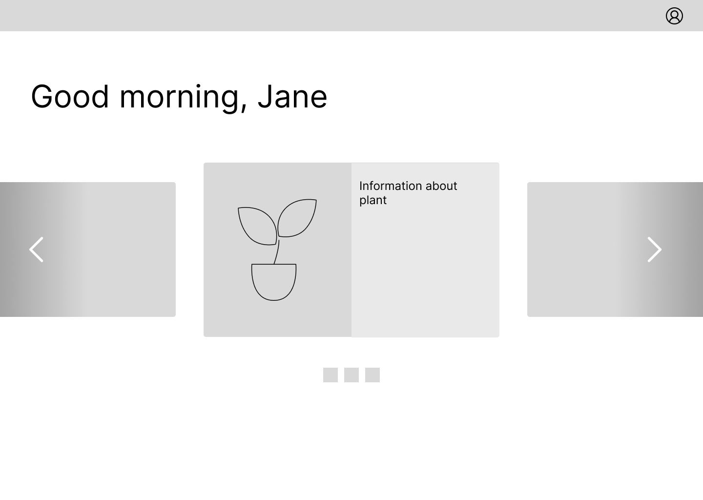
For this website, I decided there would be three main functions: the home page that would serve as a summary page, the search function which would allow users to look up plant information, and a 'my plants' page where the user could see information that they stored about their own house plants.
Within each of those pages, there would be images, graphs, and writing that would give information to the user.

After plotting out the information architecture of the website, I thought about the placement of the information and created a few sketches.
I knew that an important part of the website would be how users see all their plants, so I thought about how I could display the picture and summary of each of their plants in a simple way.
Initially, I ideated that the home page would show a carousel of plant images, but I realized quickly that it wouldn't work for a plant owner of 20+ plants - it would be too much clicking.
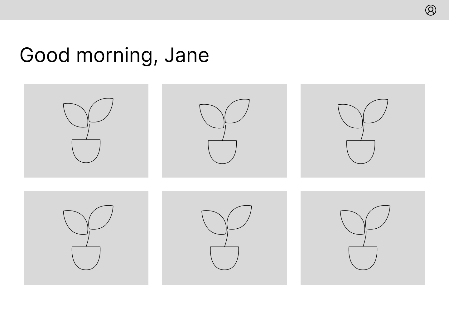
Then, I came up with the idea to display a grid of plant images and titles in the home page. This would be a quick and easy way for users to scroll through all the plants they had.
Still, it felt a little bit overwhelming, especially to the users that I first showed these wireframes to. So, I decided to implement a dashboard on the home page and a separate 'my plants' page' on the website.
Then, I designed the rest of the website, adding a search function and way to add more plants, as well as detail pages for general plant information and customized plant information.

.png)
Using the sketches and wireframes, I developed a low-fidelity prototype using the prototyping tool in Figma in order to figure out the interactions that I wanted the user to have with the interface, as well as any possible animations I wanted the UI to have.
When thinking about what personality I wanted the website to evoke, I came up with these words:
Natural
Beginner-friendly
Informative
.png)
Taking a look at our design inspiration for the app, I knew I wanted to focus on the plants. So I gave a look at the color scheme for most houseplants - obviously multiple shades of green coming from the foliage, as well as some warm hints of purples, pinks, and browns.
I also looked at how other apps that centered around plants were designed. They worked with the color of the plants and had a very simple interface so that most of the color scheme and shapes were focused on the foliage.
Similar to the interface, I knew that the logo should be straightforward.
Since the website's name is 'Sproutd', I decided to work off of that and create a logo that would show a sprout. Not only is it inspired by the name, but it is inspired by the growth that the user would hopefully go through, from a beginner plant owner to a more advanced one.
.png)
Through combining the above style elements together - along with a color palette, typography, and the UI components - I came up with the style guide.
.png)
In order to test the functionality and design of the app, I held usability tests using Maze.
In the first 4 tests, I asked the testers to complete A/B testing and 3 scenario based tasks:
In the second set of 4 tests, we asked the testers to complete the above scenario based tasks, with the changes from the A/B testing implemented.
Based on the heat map and the time that it took for users to complete their tasks, which was longer than expected, I decided to look at the designs and see where I could revise them.
.png)
.png)
.png)
One thing that was brought up during usability testing was that a few testers doubted the educational aspect of the website. Sure, they could look up information on a certain plant, but only if the user wanted to.
So, in response to that, I made sure to include more entry points into plant care articles. For instance, I added a new tile on the home dashboard page where a user could read a quick plant fact and then click into a link where they would be able to read more information about the specific plant. In the future, I would be sure to add more sections on the website where users could be educated.
I also improved the content of the website after 50% of users were confused by at least one phrase on the website, and as a result didn't act accordingly. For instance, I change 'Done' on a task button to 'Mark as done' so that a user would know to click on it once they're done with their tasks.
I also had to make a few major changes design-wise.
About 75% of the testers were overwhelmed by the design of the plant tiles in the 'My plants' page. It felt cluttered, and it definitely didn't feel accessible. It was difficult to read the link text and there were too many colors.
In response, I uplifted the design of the tiles and made it more simple, taking the link text off the image of the plant and moving it to below it. I also increased the contrast of the alert on the tile. I also made the default view for the grid less overwhelming by decreasing the number of plants per row.
To further address confusion with interactibility, as some users didn't bother to hover or click certain components, I made them more visible on the page by increasing spacing and changing the background color.
These visual and functional changes definitely improved the user experience, as after I added the improvements, there was more interaction, approval for the design, and overall enjoyment.

.png)
After one month of researching, designing, developing, and iterating, I finally came to the final version of the bus app!
View the final prototype >After presenting this project to grader, they provided me some useful insight that I'll definitely take into account in my future projects.
One of the biggest takeaways is I should take advantage of accessibility tools often when designing a website. If I had used some earlier, I wouldn't have needed to make some big design changes during my final usability tests.
In the future, I plan to design more thoughtfully, especially when making an accessible experience for all.
If you like what you see and want to work together, get in touch!