Transforming Resilient Red Hook's repository-like website into an actionable platform

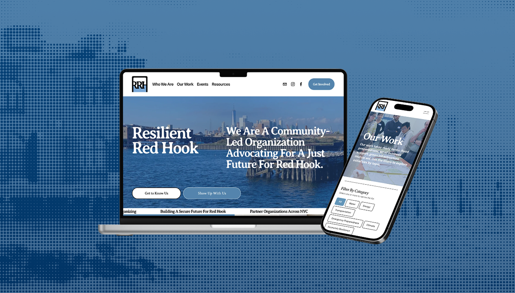
Resilient Red Hook is a volunteer-led, community-based nonprofit working to advance climate resilience, advocacy, and neighborhood agency in Red Hook, Brooklyn, New York. Our team worked with them on a website redesign that would match the organization they’ve evolved into: one no longer solely defined by Hurricane Sandy recovery, but by over a decade of advocacy for a neighborhood facing ongoing climate and social pressures.
Team
Chloe Dahan
Sisira Mondreti
Roshni Ganesh
My role
Account manager
Designer
Researcher
Tools
Figma
Squarespace
Duration
3 months

THE PROBLEM

A repository-like website that felt abandoned

Jargon-heavy pages, outdated imagery, and a homepage still anchored to Hurricane Sandy gave the impression that the organization is static outside of occasional event updates. The organization's progress has evolved, but the website just stopped keeping up.
Homepage with little wayfinding context for a first-time visitor
Resources page with 120+ links to external website, dating to 2016 and before

THE SOLUTION

An active and actionable community-led platform

Through stakeholder interviews, neighborhood field research, and a community-focused audit of 12 peer climate organizations, we shaped a content strategy and design principles, then used a co-design workshop with volunteers and community members to ground them in community voice. The result is a Squarespace site that reframes Resilient Red Hook not as a recovery effort, but as an ongoing, community-rooted force for resilience, reflecting who they are today and where the organization is headed next.

EXPLORATORY RESEARCH

Understanding Resilient Red Hook and its community

To understand RRH’s digital presence, community perception, and engagement challenges, we ran four research streams in parallel: desk research, field research, stakeholder interviews, and a heuristic evaluation.
research stream #1

Desk research

We conducted two types of desk research: literature review and competitive audit.
For the literature review, we pulled from a wide net: peer-reviewed research on community-led organizing and climate communication, local news coverage of Red Hook and RRH’s projects, grant language and funder priorities in the climate resilience space, and RRH’s own internal Google Drive of plans, meeting notes, and reports.
Our sheet describing and categorizing the hundreds of files in RRH's internal drive
For the competitive audit, we reviewed 12 websites (community land trusts, climate justice coalitions, neighborhood resilience hubs) and identified four narrative patterns RRH could draw from.
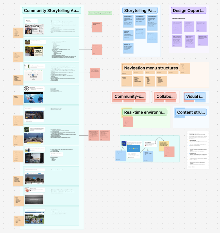
Our FigJam board of notes based on an analysis of nonprofit websites
research stream #2

Field research

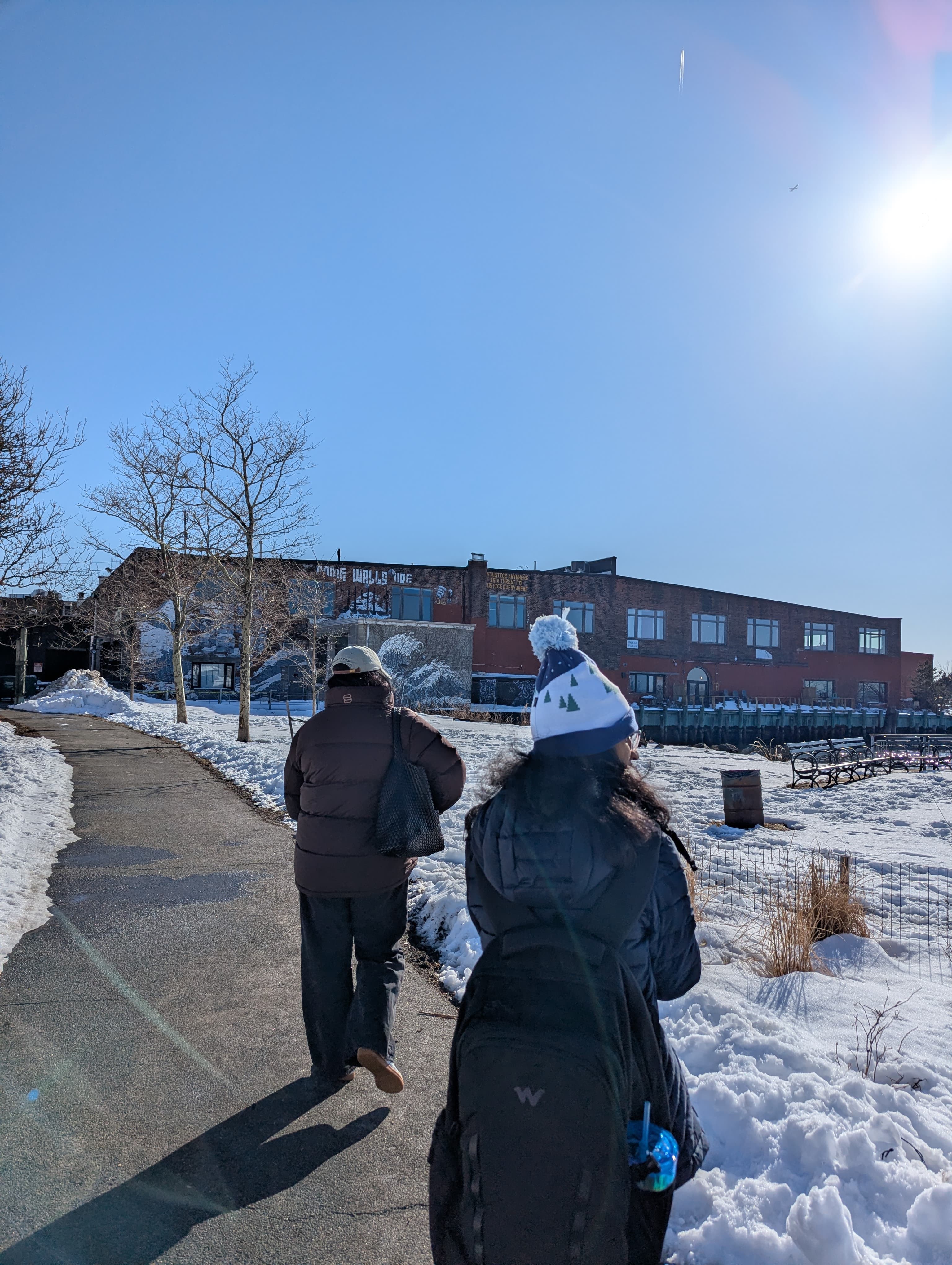
We walked the Red Hook neighborhood to observe the physical, social, and environmental context RRH operates within. We looked for RRH’s visible footprint: flyers, signage, QR codes, any indication that an active resilience organization was present in the places where its work was happening.

We found very little. That gap between the work and its visibility became one of the core insights we carried into design.
A snowy weekend in Red Hook
research stream #3

Stakeholder interviews

We conducted 8 semi-structured interviews with residents, RRH members, board members, and partner organizations. The conversations explored how people interpret RRH’s messaging, what information they seek, what they find when they look, and what would actually motivate them to take action through the website.
Notable quotes were:
“I would use it almost just like a repository instead of going to the Google Drive… it was just easier for me to go here and pull up something.”
“People who are involved with Resilient Red Hook, or who have been on the board, understand, but I don’t think that the general community in Red Hook understands.”
“The site needs to show we are engaging rather than just saying.”
research stream #4

Heuristic evaluation

Alongside the qualitative work, we ran a structured heuristic evaluation of the current site, mapping issues against established usability principles and noting where the site failed to support the audience segments we’d identified. The evaluation surfaced concrete usability problems such as broken links, dead-end pages, and navigation confusion.


FINDINGS

Three truths the research surfaced

We synthesized findings from all four research streams through affinity mapping until patterns emerged. Three insights surfaced that shaped every design decision that followed.
finding #1

There's a significant gap in community awareness.

Field research showed no visible presence throughout the neighborhood: no flyers, no QR codes, no signage in places where RRH has direct relevance. Even current and past volunteers struggled to articulate what RRH does since the organizaion’s scope is open-ended by nature.
finding #2

The website is a document repository, not a story.

Resources linked exclusively to off-site PDFs (some broken, almost all hosted on Dropbox) with titles written in jargon. There was no summary, no context, no signal of why a resident might care. The site behaved like a Google Drive index. The site told visitors what RRH had done but never what RRH was doing.
finding #3

There's no front door for newcomers.

The site was tailored to people already engaged with RRH. New visitors had no clear entry points and no sense of what membership or volunteering actually looked like. Most members were recruited through meetings or personal networks: which doesn’t scale and leaves funders some visitors without an easy way to evaluate the organization’s legitimacy.

STRATEGY

The path to strengthening resilience is through unlocking community engagement through the website.

Based on our findings, we created a strategy where we imagined that the redesigned platform becomes a scalable outreach tool, a bridge between curiosity and participation, and a front door into RRH’s work. Three design principles guided every decision:
design principle #1
Lead with the origin story
Connect past efforts, present initiatives, and future impact into one narrative
design principle #2
Make participation obvious
Action-forward prompts across roles: Join, Attend, Volunteer, Partner, Contribute
design principle #3
Make progress visible
Group initiatives under larger projects with thematic and relational tags

DESIGN PROCESS

The steps to a complete website redesign

Now that we had our completed our research and formulated a strategy and design principles, we were ready to move on to our favorite part: designing! Of course, there were other steps that we needed to complete before we were ready to finalize our designs in Squarespace.
step #1

Site and content mapping

Redesign the sitemap to consolidate the pages and introduce new flows and map out what content, especially the resources, would live on the website and where.
step #2

Wireframing

Sketch our own approaches to every page in the new IA, then come together and pull the strongest from each into a single consolidated set of wireframes.
step #3

Multiple iterations

Build a working drafts of every page on Squarespace rather than just static mockups, and with each round of iteration tighten a different layer: layout and hierarchy, copy and tone, connections, and visual identity.
step #4

Co-design workshop

Run a co-design workshop with RRH volunteers and community members with our basic structure, in order to understand how the people closest to the work would describe it themselves.
step #5

Final designs

Finalize the Squarespace website and branding in time for our final presentation!

FINAL DESIGNS

A new website to reflect a new path forward

We ended up designing 8 pages for Resilient Red Hook's redesign website:

Homepage

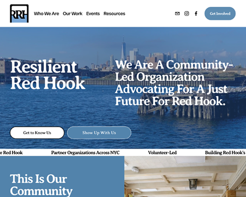
A strong tagline and CTAs in the hero to help users understand what Resilient Red Hook is
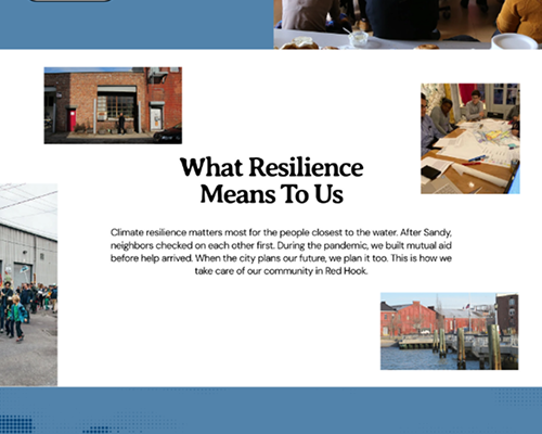
A self-written definition of resilience to guide those who don't know what resilience is
CTAs placed throughout the website to encourage visitors to join the organization in some capacity
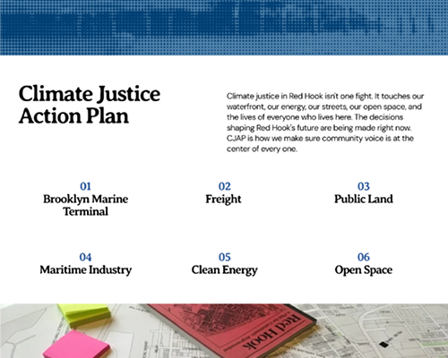
One of Resilient Red Hook's current focuses described in plain language

Who We Are

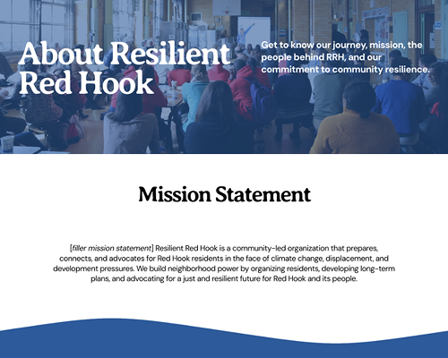
A mission statement for visitors to quickly understand the goals of Resilient Red Hook
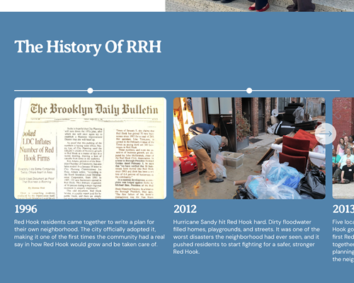
A timeline to showcase the organization's extensive and complicated history

Our Work & Initiative Details Page

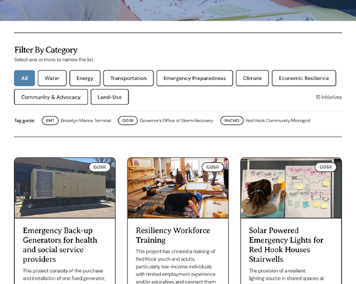
Filters and tags to help visitors organize initiatives per their needs and interests
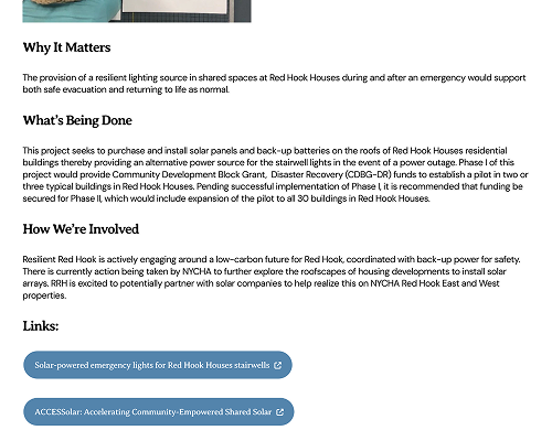
Categorized initiative details, along with links and additional media to support the reading

Events & Event Details Page

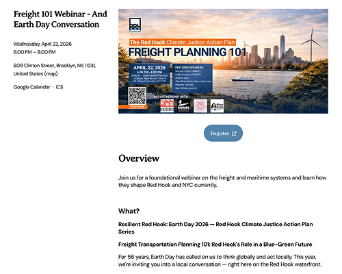
Upcoming events are highlighted and organized separately from past events
Event details are listed in a details page rather than on Events page

Resources

Resources for the community, rather than just for research purposes
Previous resources are put in a Google Drive to improve navigation

Get Involved

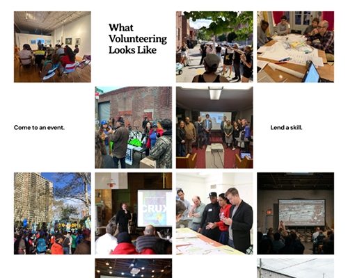
Pictures from previous events included to show it's an active volunteer organization
Volunteer interest form included on website rather than having visitor initative email

REACTIONS

The feeling of being heard

“I just want to tell you guys there was points where you talked and the way you said things made me want to cry, so it really feels so amazing also to be heard and seen and understood in a way that you guys did such a deep dive and understood the challenges, especially as volunteers, were constantly in the thick of the work… you guys did an amazing job understanding from all aspects. And I think that really translated in a lot of parts of the design.”

- RRH's interim chair, reacting to the final presentation
Throughout the project, stakeholders and community members continuously emphasized that the Red Hook community is underserved, overstudied, and fatigued. By acknowledging that throughout our process, members felt heard, and excited to have a refresh that reflected their evolving mission and plans for deeper community engagement.
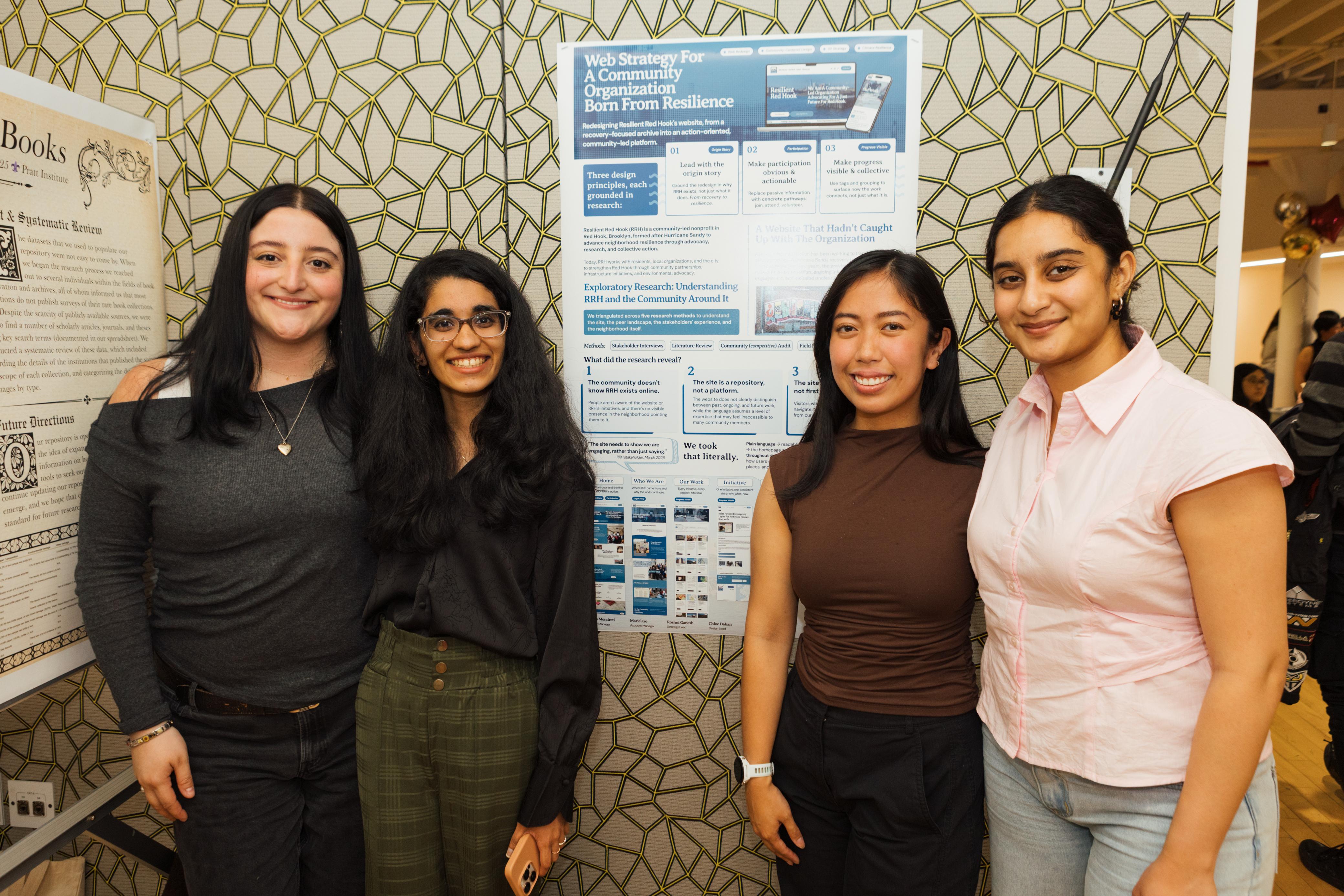
Our team in front of our poster. Pictured from left to right: Chloe, Roshni, me, and Sisira!
We were honored to present this work at Pratt InfoShow 2026, the Pratt School of Information’s annual showcase of outstanding student work. Being able to walk visitors through RRH’s story (the gap between the work and the website, the moments that changed the design, the principles that grounded the redesign) was a meaningful way to close out the project.
You've reached the bottom of the page! Now go touch some grass.