How might we improve NYU Skirball's website?
It’s hard for me to choose, I know I saw the membership levels on the previous page, but I can’t remember them.”
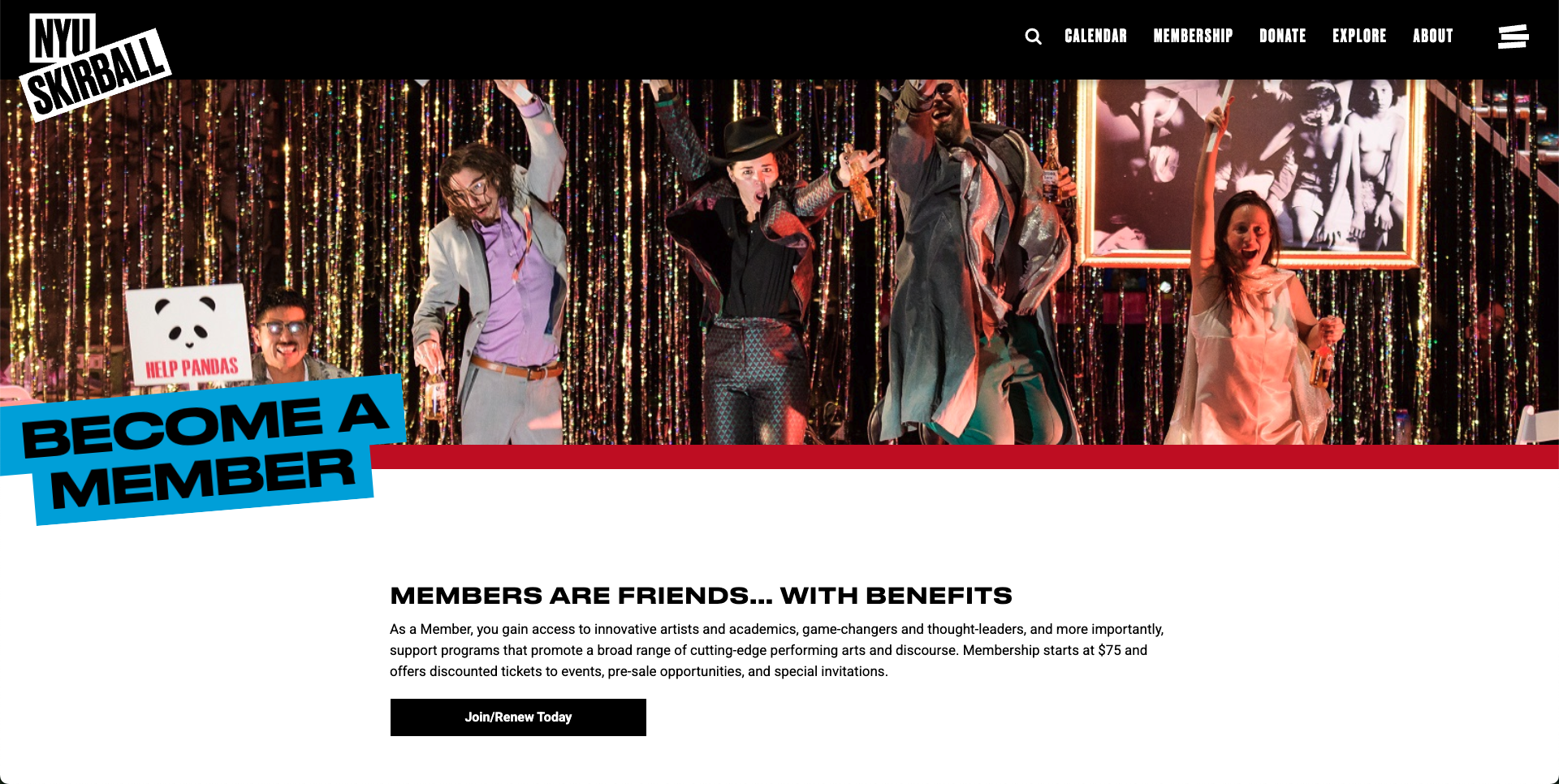
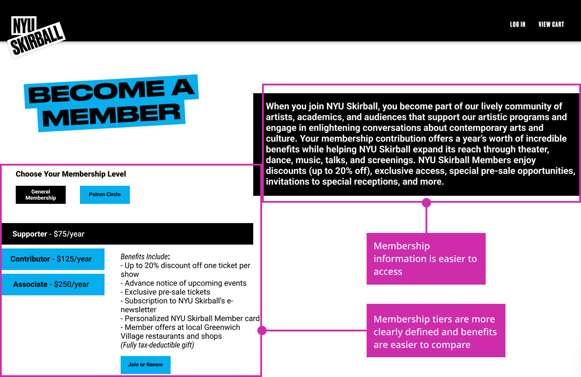
Recommendation #1: Restructure the membership tier information
The problem: The membership page is hard for users to understand. The membership tier names aren't familiar to users, and users have a hard time comparing the tiers because they have to scroll up and down to read the benefits or overall membership information.
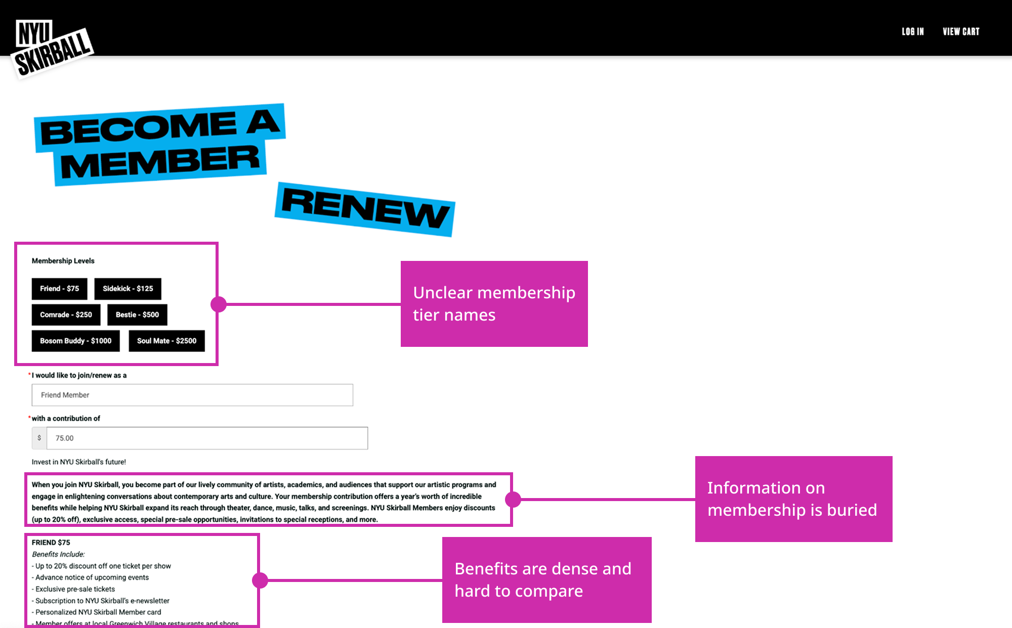
The solution: Make a component that allows users to easily switch between membership tiers to help them compare their benefits. Also make the general membership information more larger and more accessible in order to help users understand why they should get a membership in the first place.
“I’m not going to sign up for this just because I … just don’t know enough.”
Recommendation #2: Include membership information through the checkout process
The problem: There is a lack of information about membership throughout the ticketing process, meaning that users don't have enough information to prompt them to actually become a member.
The solution: Add information on membership throughout the ticketing process so that users feel persuaded to sign up for a membership.

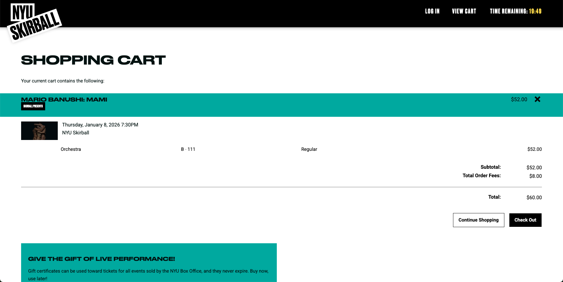
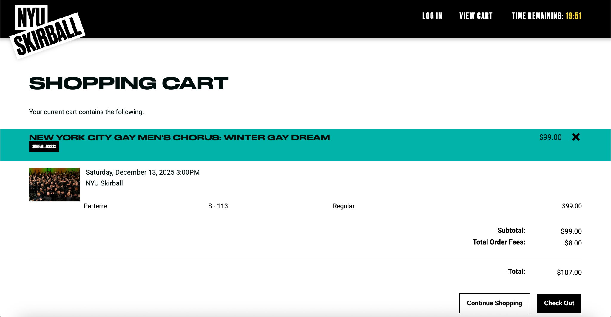
“Why won’t they let me edit my seat? … That’s really inconvenient, I think I’d just quit.”
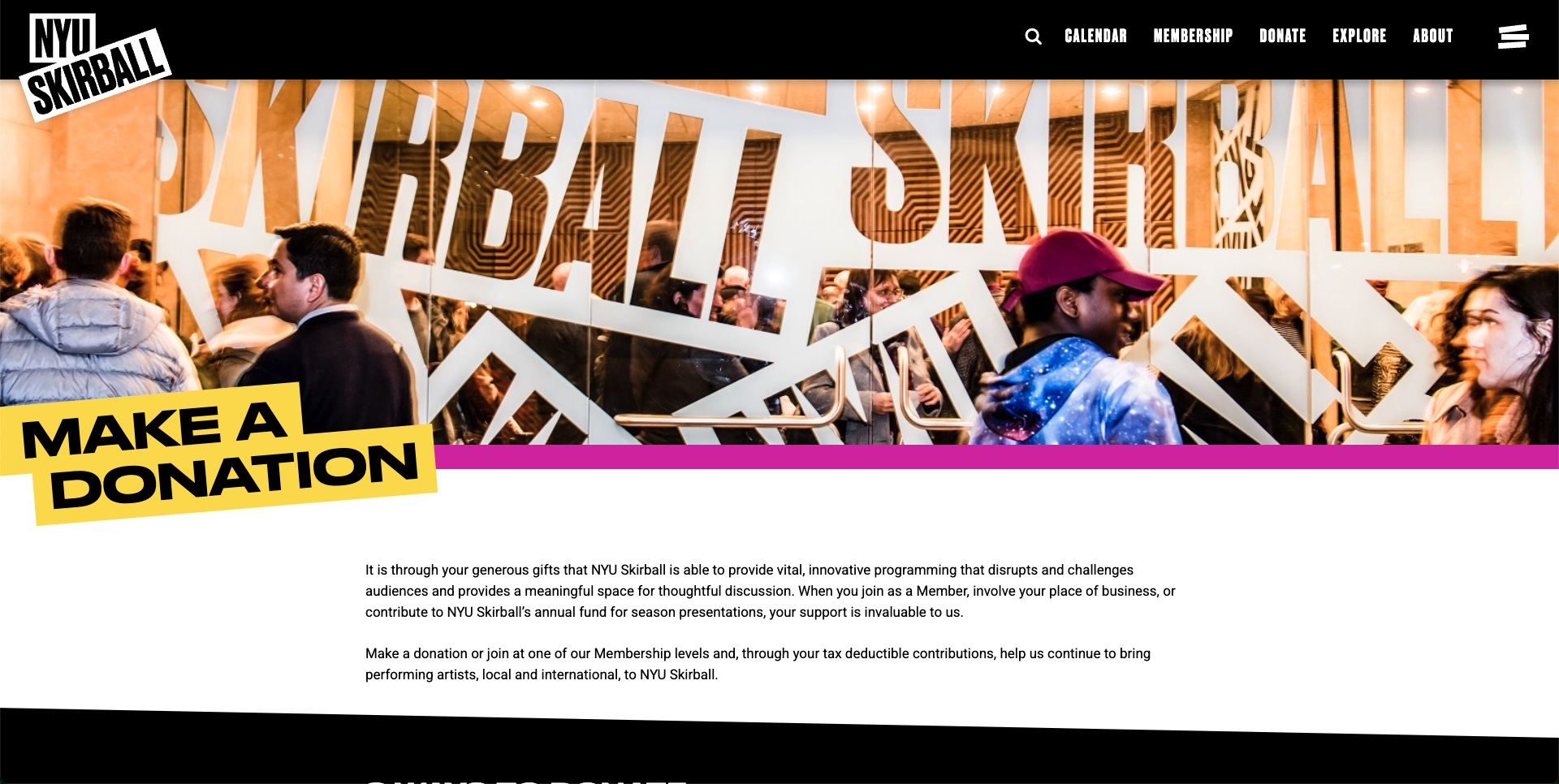
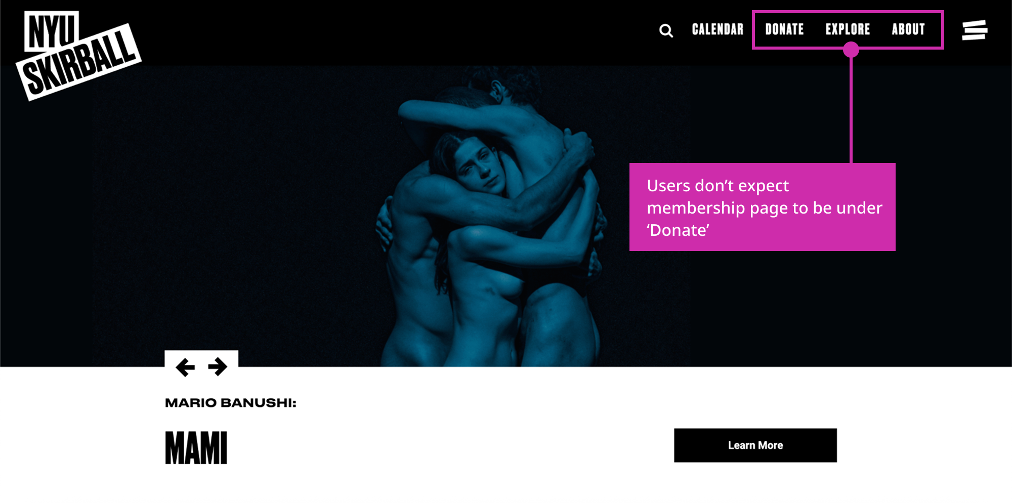
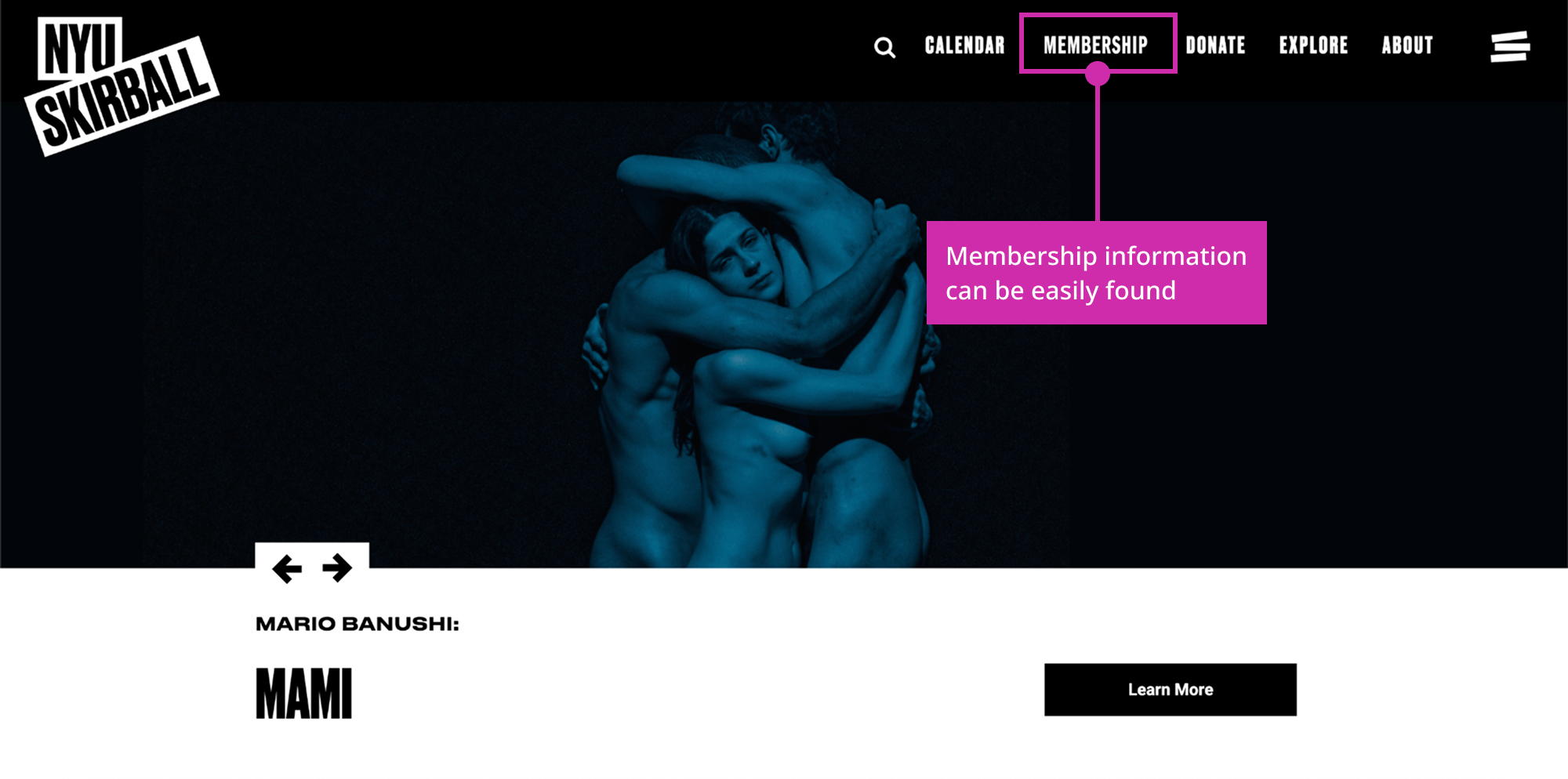
Recommendation #3: Reorganize the navigation bar
The problem: Users don't initially think that the membership page would be under the 'Donate' navigation item, so they navigate to 'Explore' or 'About' first before finding it under 'Donate'.
The solution: Create a new navigation item 'Membership' just to hold the membership page.
“Oh, that’s different … I didn’t expect it to be there at all … I really thought it would be under ‘About’ or ‘Explore.’”
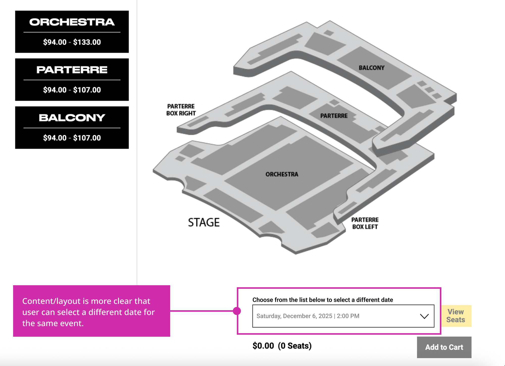
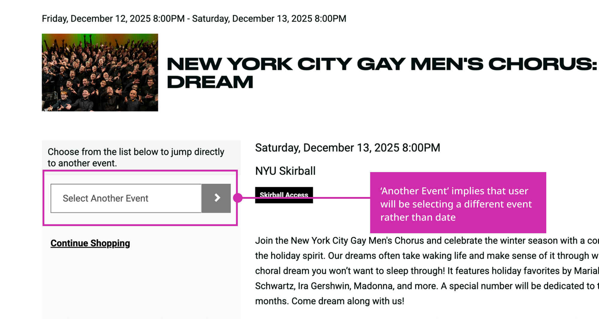
Recommendation #4: Redesign the 'Select Different Events' section
The problem: Content and layout regarding date selection aren't clear, leading users to believe that they have to re-walk through previous steps to re-select a date.
The solution: Make content more clear and date selection more obvious.